Tips for getting the best logo design for your business
One of the most underrated elements of getting your business off the ground is designing your logo. And while some thinking might insist that your logo should be the last thing on your mind, the reality is that while it’s not THE most important thing, it is one critical element in helping people recognise your brand in a split second. When it comes to brand identity design of your logo is usually front and centre.
And with something that important on the line, you want to make sure that you get the basics right.
The biggest mistake to avoid
We’ve all seen them – the Buzzfeed lists of ‘Worst Logo Design Ever’. And let’s be honest, there are some total doozies. Trust us when we tell you that if there’s any way possible that anyone will be able to see something crude in your logo, someone, somewhere, will find it. We recommend showing your logo options to a 12-year-old boy before you go ahead with it; if anyone is going to see anything snigger-worthy, it’s a pre-teen boy. If you can’t manage that, then get a few outside opinions at the very least.
Now that we’ve got that out of the way, let’s look at some of the things you’re going to want to consider if you want to make sure you have the best logo design for your business.
5 Rules for the Best Logo Design
Rule #1: White space
White space doesn’t actually have to be white – it’s the blank space between design elements. Think of it as the space that allows your design to breathe. Filling up all of the available space creates confusion for the eye and breaks rule #2.
Rule #2: Keep it simple
Simplicity is often the hardest thing to create but it’s one of the most important things you can strive for when it comes to designing your logo. Remember, your logo is going to need to be displayed in multiple different contexts and spaces: letterheads, websites, business cards, favicons, on the packaging.
That means it’s going to have to withstand different printing processes, screen resolutions and materials and STILL have to look good.
Rule #3: Colour choices
Colour choices are critical. Colours that look good on screen can look downright rubbish in print and vice versa. Gold and silver, while stunning in print with embossing and foil convert badly to screens – looking either flat and drab or downright tacky. You also need to bear in mind that sometimes your logo might need to be presented in monochrome – so making sure it looks good in black-and-white should also be high on your list of priorities.
Rule #4: Be clever, not confusing
In design, there’s a fine line between something that’s clever and something that’s incomprehensible. The best logos need to be original, recognisable, memorable and – preferably – something that relates to your brand or service in some way. The other thing you want your logo to do is to convey a feeling: think Nike’s swoosh for example.
Rule #5: Fonts matter
Don’t make people have to work too hard to figure out what you’re trying to say. Keep your fonts clean, use a tool that helps you to team up complimentary typefaces and pay attention to something that’s called kerning. Kerning is adjusting the space between each letter, generally done to make a word fit into a space better or increase readability.
You’d be amazed how much cleaner a design can look if you adjust the kerning even just a little bit. Keep in mind that handwritten, cursive and fancy fonts can be super hard for people to read so consider keeping it simple.
Finally: be patient. Sit with your design options for a few days, or even longer. Print them out and put them on different surfaces and in different spaces so that you can see what they look like out and about and make sure that you’re totally happy with how they look.
A logo is something that you’ll (hopefully) have to live with for a long time, so it’s worth taking a little extra effort, to begin with to make sure it’ll stand the test of time.
If all of this is starting to feel a bit overwhelming and you want some help with the process, we’ve got you covered. Our experienced logo design team will be able to guide you through the process step by step and makes sure that you’re 100% happy with the end result. Get in touch with us today to get your logo design process started.
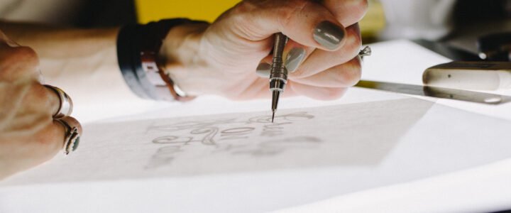
Photo by Kelly Sikkema on Unsplash


